Online and In Line
Course Syllabus
for Professor Alix | 2023 | Information Design, Graphic Design
Reimagining the syllabus as an immersive, visually-driven artifact that captured attention, reflected course themes, and reframed how students engage with academic materials.
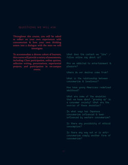
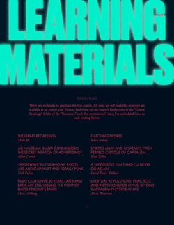
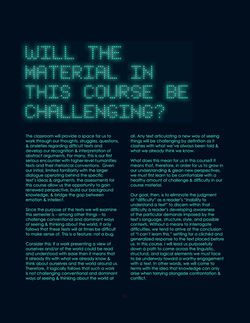
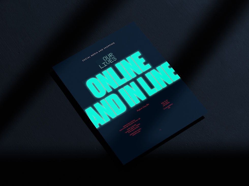
I designed a stylized course syllabus that transformed a typically overlooked document into a compelling, identity-driven experience for first-year college students. Working closely with the professor, I translated the course’s themes of consumerism, identity, and media influence into a distinct visual language that set the tone for the semester from day one. The result was a syllabus that not only communicated essential information, but actively engaged students—sparking curiosity, improving participation, and encouraging them to treat the syllabus as a meaningful reference tool rather than a formality.
 |  |  |  |
|---|---|---|---|
 |  |  |  |
 |  |  |  |
 |  |  |  |
 |  |  |  |
 |

.jpg)
.jpg)
.jpg)
01
Problem
The challenge was to redesign the syllabus — traditionally dense, passive, and often ignored — into something that demanded attention while still functioning as a clear, usable academic document. It needed to introduce complex themes around consumer culture and self-identity to first-year students, set expectations for the course, and remain readable and structured enough for ongoing reference. Balancing visual expression with academic clarity was key, as was ensuring the design aligned with the professor’s intended tone while working within the fixed content and structural requirements of a syllabus.
02
Solution
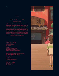
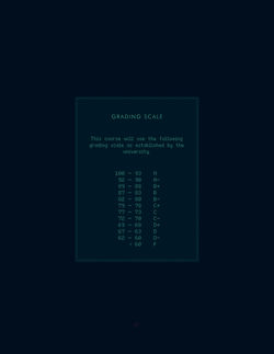
I began by working closely with the professor to understand the intellectual and emotional tone of the course, then used the syllabus content itself — along with referenced readings and films — to shape the visual direction. Drawing from cyberpunk aesthetics to mirror the course’s critique of media saturation and consumer culture, I used glowing typography on dark backgrounds to evoke the pull of screens and digital environments. This was balanced with a structured typographic system — combining lo-fi, pixel-inspired type with a traditional serif — to maintain academic credibility and hierarchy. Compositionally, I prioritized clarity and engagement by structuring content in a way that encouraged scanning while still supporting deeper reading and separated each subject into its own page or section. Throughout the process, I iterated with the professor to ensure the design accurately reflected the course’s intent and strengthened its delivery.

03
Results
The final syllabus reframed the first interaction students had with the course, turning a procedural document into an experience that generated excitement and curiosity from the outset. It helped students better engage with the course material by visually reinforcing its themes and encouraged more consistent use of the syllabus as a reference throughout the semester. By aligning form and content, the project demonstrated how even the most functional academic tools can shape perception, behavior, and investment — ultimately contributing to a more engaged and intentional learning experience.
An overlooked document transformed into a defining first impression — using design to drive engagement, curiosity, and deeper student investment from day one.